Journal List > Korean J Anesthesiol > v.75(1) > 1159825

Nahm: Receiver operating characteristic curve: overview and practical use for clinicians

Abstract

Using diagnostic testing to determine the presence or absence of a disease is essential in clinical practice. In many cases, test results are obtained as continuous values and require a process of conversion and interpretation and into a dichotomous form to determine the presence of a disease. The primary method used for this process is the receiver operating characteristic (ROC) curve. The ROC curve is used to assess the overall diagnostic performance of a test and to compare the performance of two or more diagnostic tests. It is also used to select an optimal cut-off value for determining the presence or absence of a disease. Although clinicians who do not have expertise in statistics do not need to understand both the complex mathematical equation and the analytic process of ROC curves, understanding the core concepts of the ROC curve analysis is a prerequisite for the proper use and interpretation of the ROC curve. This review describes the basic concepts for the correct use and interpretation of the ROC curve, including parametric/nonparametric ROC curves, the meaning of the area under the ROC curve (AUC), the partial AUC, methods for selecting the best cut-off value, and the statistical software to use for ROC curve analyses.

Introduction

Using diagnostic testing to determine the presence or absence of a disease is an essential process in the medical field. To determine whether a patient is diseased or not, it is necessary to select the diagnostic method with the best performance be used by comparing various diagnostic tests. In many cases, test results are obtained as continuous values, which require conversion and interpretation into dichotomous groups to determine the presence or absence of a disease. At this time, determining the cut-off value (also called the reference value) to discriminate between normal and abnormal conditions is critical. The method that is mainly used for this process is the receiver operating characteristic (ROC) curve. The ROC curve aims to classify a patient’s disease state as either positive or negative based on test results and to find the optimal cut-off value with the best diagnostic performance. The ROC curve is also used to evaluate the overall diagnostic performance of a test and to compare the performance of two or more tests.
Although non-statisticians do not need to understand all the complex mathematical equations and the analytical process associated with ROC curves, understanding the core concepts of the ROC curve analysis is a prerequisite for the correct interpretation and application of analysis results. This review describes the basic concepts for the correct use and interpretation of the ROC curve, including how to draw an ROC curve, the difference between parametric and nonparametric ROC curves, the meaning of the area under the ROC curve (AUC) and the partial AUC, the methods for selecting the best cut-off value, and the statistical software for ROC curve analysis.

Sensitivity, specificity, false positive, and false negative

To understand the ROC curve, it is first necessary to understand the meaning of sensitivity and specificity, which are used to evaluate the performance of a diagnostic test. Sensitivity is defined as the proportion of people who actually have a target disease that are tested positive, and specificity is the proportion of people who do not have a target disease that are tested negative. FP refers to the proportion of people that do not have a disease but are incorrectly tested positive, while FN refers to the proportion of people that have the disease but are incorrectly tested negative (Table 1). The ideal test would have a sensitivity and specificity equal to 1.0; however, this situation is rare in clinical practice since sensitivity and specificity tend to decrease when either of them increases.
As shown in Fig. 1, when a diagnostic test is performed, the group with the disease and the group without the disease cannot be completely divided, and overlapping exist. Fig. 1A shows two hypothetical distributions corresponding to a situation where the mean value of a test result is 75 in the diseased group and 45 in the non-diseased group. In this situation, if the cut-off value is set to 60, people with the disease who have a test result < 60 will be incorrectly classified as not having the disease (false negative). When a physician lowers the cut-off value to 55 to increase the sensitivity of the test, the number of people who will test positive increases (increased sensitivity), but the number of false positives also increases (Fig. 1B).

What is the ROC curve?

The ROC curve is an analytical method, represented as a graph, that is used to evaluate the performance of a binary diagnostic classification method. The diagnostic test results need to be classified into one of the clearly defined dichotomous categories, such as the presence or absence of a disease. However, since many test results are presented as continuous or ordinal variables, a reference value (cut-off value) for diagnosis must be set. Whether a disease is present can thus be determined based on the cut-off value. An ROC curve is used for this process.
The ROC curve was initially developed to determine between a signal (true positive result) and noise (false positive result) when analyzing signals on a radar screen during World War II. This method, which has been used for signal detection/discrimination, was later introduced to psychology [1,2] and has since been widely used in the field of medicine to evaluate the performance of diagnostic methods [36]. It has recently also been applied in various other fields, such as bioinformatics and machine learning [7,8].
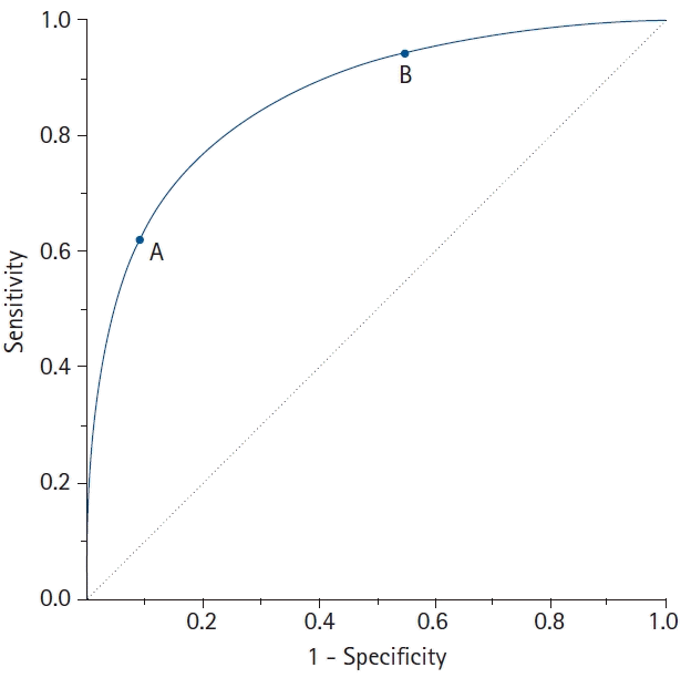
The ROC curve connects the coordinate points using “1 – specificity (false positive rate)” as the x-axis and “sensitivity” as the y-axis for all cut-off values measured from the test results. The stricter the criteria for determining a positive result, the more points on the curve shift downward and to the left (Fig. 2, Point A). In contrast, if a loose criterion is applied, the point on the curve moves upward and to the right (Fig. 2, Point B).
The ROC curve has various advantages and disadvantages. First, the ROC curve provides a comprehensive visualization for discriminating between normal and abnormal over the entire range of test results. Second, because the ROC curve shows all the sensitivity and specificity at each cut-off value obtained from the test results in the graph, the data do not need to be grouped like a histogram to draw the curve. Third, since the ROC curve is a function of sensitivity and specificity, it is not affected by prevalence, meaning that samples can be taken regardless of the prevalence of a disease in the population [9]. However, the ROC curve also has some disadvantages. The cut-off value for distinguishing normal from abnormal is not directly displayed on the ROC curve and neither is the number of samples. In addition, while the ROC curve appears more jagged with a smaller sample size, a larger sample does not necessarily result in a smoother curve.

Types of ROC curves

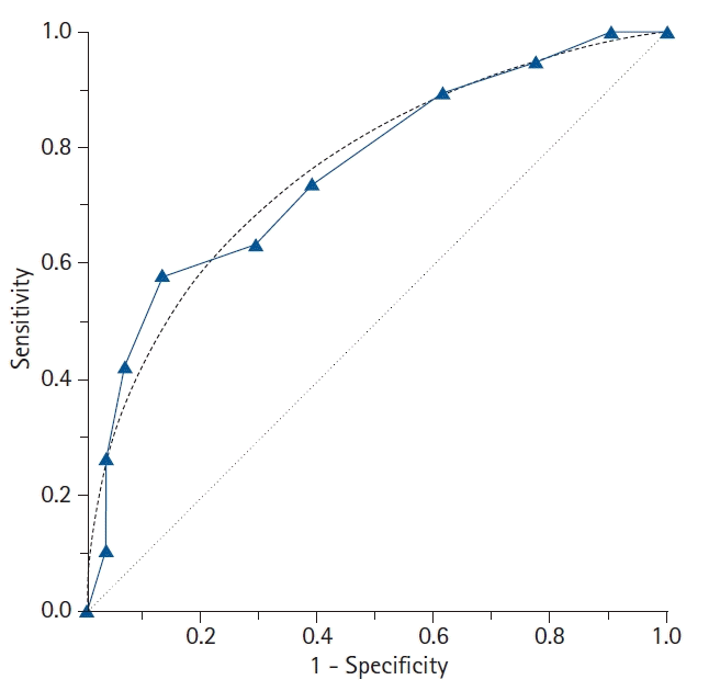
The types of ROC curves can be primarily divided into nonparametric (or empirical) and parametric. Examples of the two curves are shown in Fig. 3, and the advantages and disadvantages of these two methods are summarized in Table 2. The parametric method is also referred to as the binary method. By expanding the sample size and connecting countless points, the parametric ROC curve forms the shape of a smooth curve [10]. This method estimates the curve using a maximum likelihood estimation when the two independent groups with different means and standard deviations follow a normal distribution or meet the normality assumption through algebraic conversion or square root transformation [11,12]. If the two normal distributions obtained from the two groups have considerable overlap, the ROC curve will be close to the 45° diagonal, whereas if only small portions of the two normal distributions overlap, the ROC curve will be located much farther from the 45° diagonal.
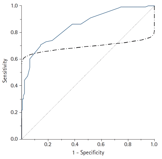
However, when the ROC curve is obtained using the parametric method, an improper ROC curve is obtained if the data does not meet the normality assumption or within-group variations are not similar (heteroscedasticity). An example of an improper parametric ROC curve is shown in Fig. 4. To use a parametric ROC curve, researchers must therefore check whether the outcome values in the diseased and non-diseased groups follow a normal distribution or a transformation is required to follow a normal distribution.
To overcome this limitation, a nonparametric ROC curve can be used since this method does not take into account the distribution of the data. This is the most commonly used ROC curve analysis method (also called the empirical method). For this method, the test results do not require an assumption of normality. The sensitivity and false positive rates calculated from the 2 × 2 table based on each cut-off value are simply plotted on the graph, resulting in a jagged line rather than a smooth curve.
Additionally, a semiparametric ROC curve is sometimes used to overcome the drawbacks of the nonparametric and parametric methods. This method has the advantage of presenting a smooth curve without requiring assumptions about the distribution of the diagnostic test results. However, many statistical packages do not include this method, and it is not widely used in the medical research.

How is a ROC curve drawn?

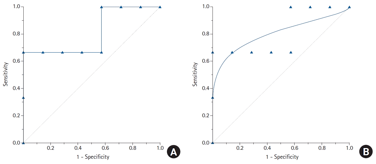
Consider an example in which a cancer marker is measured for a total of 10 patients to determine the presence of cancer, and an empirical ROC curve is drawn (Table 3). If the measured value of the cancer marker is the same as or greater than the cut-off value (reference value), the patient is determined to have cancer, whereas if the measured value is less than the reference value, normal, and a 2 × 2 table is thus created. The sensitivity and specificity change depending on the applied reference value. If the reference value is increased, the specificity increases while the sensitivity decreases. For example, if the reference value for determining cancer is ≥ 43.3, the sensitivity and specificity are calculated as 0.67 and 1.0, respectively (Table 3). To increase the sensitivity, the reference value for a cancer diagnosis is lowered. If the reference value is ≥ 29.0, the sensitivity and specificity are 1.0 and 0.43, respectively. In this way, as the reference value is gradually increased or decreased, the proportion of positive cancer results varies, and each sensitivity and specificity pair can be calculated for each cut-off value. From these calculated pairs of sensitivity and specificity, a graph with “1 – specificity” as the x coordinate and “sensitivity” as the y coordinate can be created (Fig. 5). Some researchers draw an ROC curve by expressing the x-axis as “specificity” rather than “1 – specificity”. In this case, the values on the x-axis do not increase from 0 to 1.0, but decrease from 1.0 to 0.

The area under the curve (AUC)

The AUC is widely used to measure the accuracy of diagnostic tests. The closer the ROC curve is to the upper left corner of the graph, the higher the accuracy of the test because in the upper left corner, the sensitivity = 1 and the false positive rate = 0 (specificity = 1). The ideal ROC curve thus has an AUC = 1.0. However, when the coordinates of the x-axis (1 – specificity) and the y-axis correspond to 1 : 1 (i.e., true positive rate = false positive rate), a graph is drawn on the 45° diagonal (y = x) of the ROC curve (AUC = 0.5). Such a situation corresponds to determining the presence or absence of disease by an accidental method, such as a coin toss, and has no meaning as a diagnostic tool. Therefore, for any diagnostic technique to be meaningful, the AUC must be greater than 0.5, and in general, it must be greater than 0.8 to be considered acceptable (Table 4) [13]. In addition, when comparing the performance of two or more diagnostic tests, the ROC curve with the largest AUC is considered to have a better diagnostic performance.
The AUC is often presented with a 95% CI because the data obtained from the sample are not fixed values but rather influenced by statistical errors. The 95% CI provides a range of possible values around the actual value. Therefore, for any test to be statistically significant, the lower 95% CI value of the AUC must be > 0.5.
The CI of the AUC can be estimated using the parametric or nonparametric method. The binormal method proposed by Metz [14] and McClish and Powell [15] is used to estimate the CI of the AUC using the parametric approach. These methods use the maximum likelihood under the assumption of a normal distribution. Several nonparametric approaches have also been proposed to estimate the AUC of the empirical ROC curve and its variance. One such approach, the rank-sum test using the Mann-Whitney method, approximates the variance based on the exponential distribution [16]. However, the disadvantage of the rank-sum test is that it underestimates the variance when the AUC is close to 0.5 and overestimates the variance as the AUC approaches 1. To overcome this drawback, DeLong et al. [17] proposed a method of minimizing errors in variance estimates using generalized U-statistics without considering the normality assumptions used in the binormal method, which is provided in many statistical software packages.
Nonparametric AUC estimates for empirical ROC curves tend to underestimate the AUC on a discrete rating scale, such as a 5-point scale. Except when the sample size is extremely small, the parametric method is preferred even for discrete data, because the bias in the parametric estimates of the AUC is small enough to be negligible. However, if the collected data are not normally distributed, a nonparametric method is the correct option. For continuous data, the parametric and nonparametric estimates of the AUC have very similar values [18]. In general, when the sample size is large, the AUC estimate follows a normal distribution. Therefore, when determining whether there is a statistically significant difference between the two AUCs (AUC1 vs. AUC2), the test can be tested using the following Z-statistics. To determine whether an AUC (A1) is significant under the null hypothesis, Z can be calculated by substituting A2 = 0.5.
(1)
Z=(A1 - A2) / Var(AUC)

Partial AUC (pAUC)

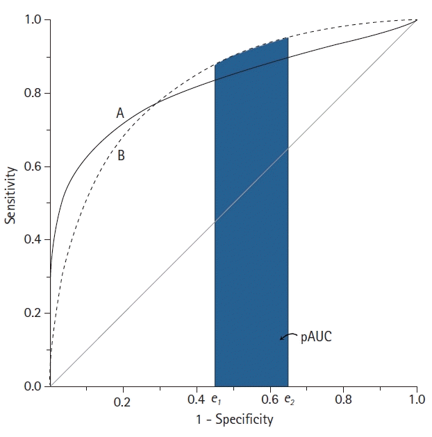
When comparing the AUC of two diagnostic tests, if the AUC values are the same, this only means that the overall diagnostic performance of the two tests are the same and not necessarily that the ROC curves of the two tests are the same [19]. For example, suppose two ROC curves intersect. In this case, even if the AUCs of the two ROC curves are the same, the diagnostic performance of test A may be superior in a specific region of the curve, and test B may be superior in another region. In this case, the pAUC can be used to evaluate the diagnostic performance in a specific region (Fig. 6) [11,12].
As its name suggests, the pAUC is the area below some of the ROC curve. It is the region between two points of false positive rate (FPR), defined as the pAUC between the two FPRs (FPR1 = e1 and FPR2 = e2), which can be expressed as A (e1 ≤ FPR ≤ e2). For the entire ROC curve to be designated, e1 = 0, e2 = 1, and e1 = e2 = e is the sensitivity at the point where FPR = e. However, a potential problem with the pAUC is that the minimum possible value of the pAUC depends on the region along the ROC curve that is selected.
The minimum possible value of the pAUC can be expressed as 12(e2-e1)(e2+e1) [15]. However, one issue is that the minimum pAUC value in the range 0 ≤ FPR ≤ 0.2 is 12(0.2 - 0)(0.2 + 0) = 0.02, whereas in the range 0.8 ≤ FPR ≤ 1.0, the minimum value of the pAUC is 12(1.0 - 0.8)(1.0 + 0.8) = 0.18. Therefore, unlike the AUC, in which the maximum possible value is always 1, the pAUC value depends on the two chosen FPRs. Therefore, the pAUC must be standardized. To do this, the pAUC is divided by the maximum value that the pAUC can have, which is called the partial area index [20]. The partial area index can be interpreted as the average sensitivity in the selected FPR interval. In addition, the maximum pAUC between FPR1 = e1 and FPR2 = e2 is equal to e2e1, which is the width of the region when sensitivity = 1.0. By using the pAUC, it is possible to focus on the region of the ROC curve appropriate to a specific clinical situation. Therefore, the performance of the diagnostic test can be evaluated in a specific FPR interval that is appropriate to the purpose of the study.

The sample size for the ROC curve analysis

To calculate the sample size for the ROC curve analysis, the expected AUCs to be compared (namely, AUC1 and AUC2, where AUC2 = 0.5 for the null hypothesis), the significance level (α), power (1 – β), and the ratio of negative/positive results should be considered [16]. For example, if there are twice as many negative results as positive results, the ratio = 2, and if there is the same number of negative and positive results, the ratio = 1. If two tests are performed on the same group to evaluate test performance, the two ROC curves are not independent of each other. Therefore, two correlation coefficients are additionally needed between the two diagnostic methods both for cases showing negative results and those showing positive results [21]. The correlation coefficient required here is Pearson’s correlation coefficient when the test result is measured as a continuous variable and Kendalls’ tau (τ) when measured as an ordinal variable [21].

Determining the optimal cut-off value

In general, it is crucial to set a cut-off value with an appropriate sensitivity and specificity because applying less stringent criteria to increase sensitivity results in a trade-off in which specificity decreases. Finding the optimal cut-off value is not simply done by maximizing sensitivity and specificity, but by finding an appropriate compromise between them based on various criteria. Sensitivity is more important than specificity when a disease is highly contagious or associated with serious complications, such as COVID-19. In contrast, specificity is more important than sensitivity when a test to confirm the diagnosis is expensive or highly risky. If there is no preference between sensitivity and specificity, or if both are equally important, then the most reasonable approach is to maximize them both. Since the methods introduced here are based on various assumptions, the choice of which method to use should be judged based on the importance of the sensitivity versus the specificity of the test. There are more than 30 methods known to find the optimal cut-off value [22]. Some of the commonly used methods are introduced below.

Youden’s J statistic

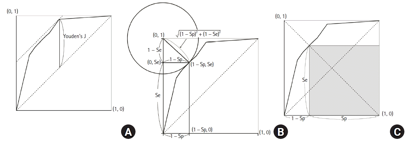
Youden’s J statistic refers to the distance between the 45° diagonal and the ROC curve while moving the 45° diagonal (a straight line with a slope of 1) in the coordinate (0, 1) direction (Fig. 7A). Youden’s J statistic can be calculated as follows, where the point at which this value is maximized is determined as the optimal cut-off value [23].
(2)
J = Se + Sp - 1

Euclidean distance

Another method for determining the optimal reference value is to use the Euclidean distance from the coordinate (0, 1), which is also called the upper-left (UL) index [24]. For this method, the optimal cut-off value is determined using the basic principle that the AUC value should be large. Therefore, the distance between the coordinates (0, 1) and the ROC curve should be minimized [25,26]. The Euclidean distance is calculated as follows:
(3)
Euclidean distance = (1 - Se)2 + (1 - Sp)2
The point at which this value is minimized is considered the optimal cut-off value. The Euclidean distance on the ROC curve is shown in Fig. 7B.

Accuracy

Accuracy refers to the proportion of the cases that are accurately classified, as shown in Table 1.
(4)
Accuracy = True positive number + True negative numberTotal number
This definition assumes that all correctly classified results (whether it is true positive or true negative) are of equal value, and all misclassified results are equally undesirable. However, this is often not the case. The costs of false-positive and false-negative classifications are rarely equivalent; the more significant the cost difference between false positive and false negative results, the more likely that the accuracy distorts the clinical usefulness of the test results. Accuracy is highly dependent on the prevalence of a disease in the sample; therefore, even when the sensitivity and specificity are low, the accuracy may be high [27]. In addition, this method has a disadvantage because, as sensitivity and specificity change, there may be two or more points at which this value is maximized.

Index of union (IU)

IU uses the absolute difference between the diagnostic measurement and the AUC value to minimize the misclassification rate, calculated using the following formula [28]:
(5)
IU = (Se - AUC + Sp - AUC)
IU is a method for finding the point at which the sensitivity and specificity are simultaneously maximized. It is similar to the Euclidean distance; however, it differs in that it uses the absolute differences between the AUC value and diagnostic accuracy measurements (sensitivity and specificity). This method does not require complicated calculations since it only involves checking whether the sensitivity and specificity at the optimal cut-off value are sufficiently close to the AUC values. In addition, the IU has been found to have a better diagnostic performance compared to the other methods in most cases [28].

Cost approach

The cost approach is a method for finding the optimal cut-off value that takes into account the benefits of correct classification or the costs of misclassification. This method can be used when the costs of true positives (TPs), true negatives (TNs), false positives (FPs), and false negatives (FNs) of a diagnostic test are known. The costs here can be medical or financial and can be considered from a patient and/or social perspective. When determining the cut-off value using the cost approach, there are two ways; to calculate the cost itself [27], or use the cost index (fm) [29]. These are calculated as follows:
(6)
Cost = CFN (1 - Se) Pr +CFP (1 - Sp)(1 - Pr) + CTPSe Pr + CTNSp (1 - Pr)fm = Se - (1 - PrPr × CFP - CTNCFN - CTP)(1 - Sp)
where Pr is prevalence and CFP, CTN, CFN, and CTP refer to the costs of FPs, TNs, FNs, and TPs, respectively. These four costs should be expressed as a common unit. When the cost index (fm) is maximized, the average cost is minimized, and this point is considered the optimal cut-off value.
Another method for determining the optimal cut-off value in terms of cost is to use the misclassification cost term (MCT). Considering only the prevalence of the disease, the CFP, and the CFN, the point at which the MCT is minimized is determined as the optimal cut-off value [29] and expressed as follows:
(7)
MCT =CFNCFP × Pr (1 - Se) + (1 - Pr)(1 - Sp)

Positive likelihood ratio (LR+) and negative likelihood ratio (LR)

LR+ is the ratio of true positives to false positives, and LR is the ratio of false negatives to true negatives.
(8)
LR+ = TP / FP = Se / (1 - Sp)    LR = FN / TN (1 - Se) / Sp
Researchers can choose a cut-off value that either maximizes LR+ or minimizes LR.

Maximum product of sensitivity and specificity

For this method, the point at which the product of Se and Sp is maximized is considered the optimal cut-off value.
(9)
Maximum product = max [Se × Sp]
This can also be represented graphically, as shown in Fig. 7C. A square can be obtained whose vertex is on the line connecting the unit square’s upper left and lower right corners within the ROC curve (Se = Sp line). When this square meets the ROC curve, Se × Sp is maximized.

Maximum sum of sensitivity and specificity

For this method, the point at which the sum of Se and Sp is maximized is considered the optimal cut-off value.
(10)
Maximum sum = max [Se + Sp]
At the point where the summation value is maximized, Youden’s index (Se + Sp – 1) and the difference between the true positives (Se) and false positives (1 – Sp) are also maximized [25]. This method is straightforward; however, the drawback is that as the Se and Sp change, there may be more than one point at which this value is maximized. When there are two or more points at which the summed value is maximized, the researcher must decide whether to determine the optimal cut-off value based on the sensitivity or the specificity.

Number needed to misdiagnose (NNM)

This method refers to the number of patients required to obtain one misdiagnosis when conducting a diagnostic test. In other words, if NNM = 10, it means that ten people must be tested to find one misdiagnosed patient. The higher the NNM, the better the test performance. NNM is calculated as follows, and the point at which the NNM is maximized can be selected as the optimal cut-off value [30]:
(11)
NNM = 1FN + FP = 1Pr (1 - Se) + (1 - Pr)(1 - Sp)

Statistical program for the ROC curve analysis

Statistical programs used to perform the ROC curve analysis include various commercial software programs such as IBM SPSS, MedCalc, Stata, and NCSS and open-source software such as R. Most statistical analysis software programs provide basic ROC analysis functions. However, the functions provided by each software product are slightly different. IBM SPSS, the most widely used commercial software, can provide fundamental statistical analyses for ROC curves, such as plotting ROC curves, calculating the AUC, and CIs with statistical significance. However, IBM SPSS does not include various functions for optimal cut-off values and does not provide a sample size calculation. Stata provides a variety of functions for ROC curve analyses, including the pAUC, multiple ROC curve comparisons, optimal cut-off value determination using Youden’s index, and multiple performance measures. MedCalc, as the name suggests, is a software developed specifically for medical research. MedCalc provides a sample size estimation for a single diagnostic test and includes various analytical techniques to determine the optimal cut-off value but does not provide a function to calculate the pAUC.
Unlike commercial software packages, the R program is a free, open-source software that includes all the functions for ROC curve analyses using packages such as ROCR [31], pROC [32], and OptimalCutpoints [22]. Among the R packages, the ROCR is one of the most comprehensive packages for analyzing ROC curves and includes functions to calculate the AUC with CIs; however, options for selecting the optimal cut-off value are very limited. The pROC provides more comprehensive and flexible functions than the ROCR. The pROC can be used to compare the AUC with the pAUC using various methods and it provides CIs for sensitivity, specificity, the AUC, and the pAUC. Similar to the ROCR, the pROC also provides some functions for determining the optimal cut-off value, which can be determined using Youden’s index and the UL index. The pROC can also be used to calculate the sample size required for a single diagnostic test or to compare two diagnostic tests. OptimalCutpoints is a sophisticated R package specially developed to determine the optimal cut-off value. It has the advantage of providing 34 methods for determining the optimal cut-off value.
Although these R packages have a considerable number of functions, they require good programming knowledge of the R language. Therefore, for someone who is not an R user, working with a command-based interface may be challenging and time-consuming. Therefore, a web-based tool that combines several R packages has recently been developed to overcome these shortcomings, enabling a more straightforward ROC analysis. The web tool for the ROC curve analysis based on R, which includes easyROC and plotROC [33,34], is a web-based application that uses the R packages plyr, pROC, and OptimalCutpoints to perform ROC curve analyses, extending the functions of multiple ROC packages in R so that researchers can perform ROC curve analyses through an easy-to-use interface without writing R code. The functions of various statistical packages for ROC curve analyses are compared and presented in Table 5.

Summary

The ROC curve is used to represent the overall performance of a diagnostic test by connecting the coordinate points with “1 – specificity” (= false positive rate) as the x-axis and “sensitivity” as the y-axis for all cut-off point at which the test results are measured. It is also used to determine the optimal cut-off value for diagnosing a disease. The AUC is a measure of the overall performance of a diagnostic test and can be interpreted as the average value of sensitivities for all possible specificities. The AUC has a value between 0 and 1 but is meaningful as a diagnostic test only when it is > 0.5. The larger the value, the better the overall performance of the test. Since nonparametric estimates of the AUC tend to be underestimated with discrete grade scale data, whereas parametric estimates of the AUC have a low risk of bias unless the sample size is very small, it is recommended to use parametric estimates for discrete grade scale data. When evaluating the diagnostic performance of a test only in some regions of the overall ROC curve, the pAUC should be used in specific FPR regions.
Youden’s index, Euclidean distance, accuracy, and cost index can be used to determine the optimal cut-off value. However, the approach should be selected according to the clinical situation that the researcher intends to analyze. Various commercial programs and R packages as well as a web tool based on R can be used for ROC curve analyses.
In conclusion, the ROC curve is a statistical method used to determine the diagnostic method and the best cut-off value showing the best diagnostic performance. The best diagnostic test method and the optimal cut-off value should be determined using the appropriate method.

ACKNOWLEDGMENTS

The author would like to thank Ms. Mihee Park at the Seoul National University Bundang Hospital for her assistance in editing the figures included in this paper.

Notes

Funding

None.

Conflicts of Interest

No potential conflict of interest relevant to this article was reported.

References

1. Tanner WP Jr, Swets JA. A decision-making theory of visual detection. Psychol Rev. 1954; 61:401–9.
crossref
2. Lusted LB. Signal detectability and medical decision-making. Science. 1971; 171:1217–9.
crossref
3. Joo Y, Cho HR, Kim YU. Evaluation of the cross-sectional area of acromion process for shoulder impingement syndrome. Korean J Pain. 2020; 33:60–5.
crossref
4. Lee S, Cho HR, Yoo JS, Kim YU. The prognostic value of median nerve thickness in diagnosing carpal tunnel syndrome using magnetic resonance imaging: a pilot study. Korean J Pain. 2020; 33:54–9.
crossref
5. Wang L, Shen J, Das S, Yang H. Diffusion tensor imaging of the C1-C3 dorsal root ganglia and greater occipital nerve for cervicogenic headache. Korean J Pain. 2020; 33:275–83.
crossref
6. Jung SM, Lee E, Park SJ. Validity of bispectral index monitoring during deep sedation in children with spastic cerebral palsy undergoing injection of botulinum toxin. Korean J Anesthesiol. 2019; 72:592–8.
crossref
7. Sonego P, Kocsor A, Pongor S. ROC analysis: applications to the classification of biological sequences and 3D structures. Brief Bioinform. 2008; 9:198–209.
crossref
8. Sui Y, Lu K, Fu L. Prediction and analysis of novel key genes ITGAX, LAPTM5, SERPINE1 in clear cell renal cell carcinoma through bioinformatics analysis. PeerJ. 2021; 9:e11272.
crossref
9. Hajian-Tilaki K. Receiver operating characteristic (ROC) curve analysis for medical diagnostic test evaluation. Caspian J Intern Med. 2013; 4:627–35.
10. Obuchowski NA. Receiver operating characteristic curves and their use in radiology. Radiology. 2003; 229:3–8.
crossref
11. Obuchowski NA. ROC analysis. AJR Am J Roentgenol. 2005; 184:364–72.
crossref
12. Zou KH, O’Malley AJ, Mauri L. Receiver-operating characteristic analysis for evaluating diagnostic tests and predictive models. Circulation. 2007; 115:654–7.
crossref
13. Muller MP, Tomlinson G, Marrie TJ, Tang P, McGeer A, Low DE, et al. Can routine laboratory tests discriminate between severe acute respiratory syndrome and other causes of community-acquired pneumonia? Clin Infect Dis. 2005; 40:1079–86.
crossref
14. Metz CE. Basic principles of ROC analysis. Semin Nucl Med. 1978; 8:283–98.
crossref
15. McClish DK, Powell SH. How well can physicians estimate mortality in a medical intensive care unit? Med Decis Making. 1989; 9:125–32.
crossref
16. Hanley JA, McNeil BJ. The meaning and use of the area under a receiver operating characteristic (ROC) curve. Radiology. 1982; 143:29–36.
crossref
17. DeLong ER, DeLong DM, Clarke-Pearson DL. Comparing the areas under two or more correlated receiver operating characteristic curves: a nonparametric approach. Biometrics. 1988; 44:837–45.
crossref
18. Zhou X-H, McClish DK, Obuchowski NA. Statistical methods in diagnostic medicine. New York: John Wiley & Sons;2002.
19. Metz CE. ROC methodology in radiologic imaging. Invest Radiol. 1986; 21:720–33.
crossref
20. Jiang Y, Metz CE, Nishikawa RM. A receiver operating characteristic partial area index for highly sensitive diagnostic tests. Radiology. 1996; 201:745–50.
crossref
21. Hanley JA, McNeil BJ. A method of comparing the areas under receiver operating characteristic curves derived from the same cases. Radiology. 1983; 148:839–43.
crossref
22. López-Ratón M, Rodríguez-Álvarez MX, Cadarso-Suárez C, Gude-Sampedro F. OptimalCutpoints: An R package for selecting optimal cutpoints in diagnostic tests. J Stat Softw. 2014; 61:1–36.
23. Youden WJ. Index for rating diagnostic tests. Cancer. 1950; 3:32–5.
crossref
24. Koyama T, Hamada H, Nishida M, Naess PA, Gaarder C, Sakamoto T. Defining the optimal cut-off values for liver enzymes in diagnosing blunt liver injury. BMC Res Notes. 2016; 9:41.
crossref
25. Akobeng AK. Understanding diagnostic tests 3: receiver operating characteristic curves. Acta Paediatr. 2007; 96:644–7.
crossref
26. Hobden B, Schwandt ML, Carey M, Lee MR, Farokhnia M, Bouhlal S, et al. The validity of the Montgomery-Asberg Depression Rating Scale in an inpatient sample with alcohol dependence. Alcohol Clin Exp Res. 2017; 41:1220–7.
crossref
27. Zweig MH, Campbell G. Receiver-operating characteristic (ROC) plots: a fundamental evaluation tool in clinical medicine. Clin Chem. 1993; 39:561–77.
crossref
28. Unal I. Defining an optimal cut-point value in ROC analysis: an alternative approach. Comput Math Methods Med. 2017; 2017:3762651.
crossref
29. Greiner M. Two-graph receiver operating characteristic (TG-ROC): update version supports optimisation of cut-off values that minimise overall misclassification costs. J Immunol Methods. 1996; 191:93–4.
crossref
30. Habibzadeh F, Yadollahie M. Number needed to misdiagnose: a measure of diagnostic test effectiveness. Epidemiology. 2013; 24:170.
31. Sing T, Sander O, Beerenwinkel N, Lengauer T. ROCR: visualizing classifier performance in R. Bioinformatics. 2005; 21:3940–1.
crossref
32. Robin X, Turck N, Hainard A, Tiberti N, Lisacek F, Sanchez JC, et al. pROC: an open-source package for R and S+ to analyze and compare ROC curves. BMC Bioinformatics. 2011; 12:77.
crossref
33. Goksuluk D, Korkmaz S, Zararsiz G, Karaagaoglu AE. easyROC: an interactive web-tool for ROC curve analysis using R language environment. R J. 2016; 8:213–30.
crossref
34. Sachs MC. plotROC: a tool for plotting ROC curves. J Stat Softw. 2017; 79:2.
crossref

Fig. 1.
Graphical illustrations of two hypothetical distributions for patients with or without disease of interest. The vertical line indicates the cut-point criterion to determine the presence of the disease. TN: true negative, TP: true positive, FN: false negative, FP: false positive.
kja-21209f1.tif
Fig. 2.
A receiver operating characteristic (ROC) curve connects coordinate points with 1 - specificity (= false positive rate) as the x-axis and sensitivity as the y-axis at all cut-off values measured from the test results. When a strict cut-off point (reference) value is applied, the point on the curve moves downward and to the left (Point A). When a loose cut-off point value is applied, the point moves upward and to the right (Point B). The 45° diagonal line serves as the reference line, since it is the ROC curve of random classification.
kja-21209f2.tif
Fig. 3.
The features of the empirical (nonparametric) and binormal (parametric) receiver operating characteristic (ROC) curves. In contrast to the empirical ROC curve, the binormal ROC curve assumes the normal distribution of the data, resulting in a smooth curve. For estimating the binormal ROC curve, the sample mean and sample standard deviation are calculated from the disease-positive group and the disease-negative group. The 45° diagonal line serves as the reference line, since it is the ROC curve of random classification.
kja-21209f3.tif
Fig. 4.
A comparison of the empirical (solid line) and parametric (dot-dashed line) receiver operating characteristic (ROC) curves drawn from the same data. In contrast to the empirical ROC curve, an inappropriate parametric ROC curve can be distorted or pass through the 45° diagonal line if the data are not normally distributed or heteroscedastic. In this case, the empirical method is recommended to overcome this problem.
kja-21209f4.tif
Fig. 5.
Empirical (A) and parametric (B) receiver operating characteristic (ROC) curves drawn from the data in Table 3. Eleven labeled points on the empirical ROC curve correspond to each cut-off value to estimate sensitivity and specificity. A gradual increase or decrease of the cut-off values will change the proportion of disease-positive patients. Depending on the cut-off values, each sensitivity and specificity pair can be obtained. Using these calculated sensitivity and specificity pairs, a ROC curve can be obtained with “1 – specificity” as the x coordinates and “sensitivity” as the y coordinates.
kja-21209f5.tif
Fig. 6.
Schematic diagram of two receiver operating characteristic (ROC) curves with an equal area under the ROC curve (AUC). Although the AUC is the same, the features of the ROC curves are not identical. Test B shows better performance in the high false-positive rate range than test A, whereas test A is better in the low false-positive range. In this example, the partial AUC (pAUC) can compare these two ROC curves at a specific false positive rate range.
kja-21209f6.tif
Fig. 7.
Figures illustrating the various methods to select the best cut-off values. (A) Youden’s J statistics, (B) Euclidean distance to the upper-left corner, and (C) maximum multiplication of sensitivity and specificity.
kja-21209f7.tif
Table 1.
The Decision Matrix
Predicted condition
Test (+) Test (-)
True condition Disease (+) a b
Disease (-) c d

The receiver operating characteristic curve is drawn with the x-axis as 1 - specificity (false positive) and the y-axis as sensitivity. sensitivity = a / (a + b), specificity = d / (c + d), false negative = b / (a + b), false positive = c / (c + d), and accuracy = (a + d) / (a + b + c + d).

Table 2.
Pros and Cons of the Nonparametric (Empirical) and Parametric Receiver Operating Characteristic Curve Approaches
Nonparametric ROC curve Parametric ROC curve
Pros No need for assumptions about the distribution of data. Shows a smooth curve.
Provides unbiased estimates of sensitivity and specificity. Compares plots at any sensitivity and specificity value.
The plot passes through all points.
Uses all data.
Computation is simple.
Cons Has a jagged or staircase appearance. Actual data are discarded.
Compares plots only at observed values of sensitivity or specificity. Curve does not necessarily go through actual points.
ROC curves and the AUC are possibly biased.
Computation is complex.

ROC: receiver operating characteristic curve, AUC: area under the curve.

Table 3.
An Example of Simple Data with Ten Patients for Drawing Receiver Operating Characteristic Curves
Patient Confirmed cancer Tumor marker (continuous value)
1 (-) 25.8 25.8 25.8 25.8 25.8 25.8 25.8 25.8 25.8 25.8 25.8
2 (-) 26.6 26.6 26.6 26.6 26.6 26.6 26.6 26.6 26.6 26.6 26.6
3 (-) 28.1 28.1 28.1 28.1 28.1 28.1 28.1 28.1 28.1 28.1 28.1
4 (+) 29.0 29.0 29.0 29.0 29.0 29.0 29.0 29.0 29.0 29.0 29.0
5 (-) 30.5 30.5 30.5 30.5 30.5 30.5 30.5 30.5 30.5 30.5 30.5
6 (-) 31.0 31.0 31.0 31.0 31.0 31.0 31.0 31.0 31.0 31.0 31.0
7 (-) 33.6 33.6 33.6 33.6 33.6 33.6 33.6 33.6 33.6 33.6 33.6
8 (-) 39.3 39.3 39.3 39.3 39.3 39.3 39.3 39.3 39.3 39.3 39.3
9 (+) 43.3 43.3 43.3 43.3 43.3 43.3 43.3 43.3 43.3 43.3 43.3
10 (+) 45.8 45.8 45.8 45.8 45.8 45.8 45.8 45.8 45.8 45.8 45.8
Tumor marker (binary results)
(+) (-) (+) (-) (+) (-) (+) (-) (+) (-) (+) (-) (+) (-) (+) (-) (+) (-) (+) (-) (+) (-)
Confirmed cancer (+) 3 0 3 0 3 0 3 0 2 1 2 1 2 1 2 1 2 1 1 2 0 3
(-) 7 0 6 1 5 2 4 3 4 3 3 4 2 5 1 6 0 7 0 7 0 7
Sensitivity 1.00 1.00 1.00 1.00 0.67 0.67 0.67 0.67 0.67 0.33 0
Specificity 0.00 0.14 0.29 0.43 0.43 0.57 0.71 0.86 1.00 1.00 1.00

Suppose three patients had biopsy-confirmed cancer diagnoses. The grey-colored values refer to the cases determined to be cancer according to each cut-off value highlighted in bold. The continuous test results can be transformed into binary categories by comparing each value with the cut-off (reference) value. As the cut-off value increases, the sensitivity for cancer diagnosis decreases and the specificity increases. At each cut-off value, one pair of sensitivity and specificity values can be obtained from the 2 x 2 table.

Table 4.
Interpretation of the Area Under the Curve
Area under the curve (AUC) Interpretation
0.9 ≤ AUC Excellent
0.8 ≤ AUC < 0.9 Good
0.7 ≤ AUC < 0.8 Fair
0.6 ≤ AUC < 0.7 Poor
0.5 ≤ AUC < 0.6 Fail

For a diagnostic test to be meaningful, the AUC must be greater than 0.5. Generally, an AUC ≥ 0.8 is considered acceptable.

Table 5.
Comparison of the Statistical Packages for Receiver Operating Characteristic Curve Analyses
Statistical packages ROC plot Confidence interval pAUC Multiple comparisons Cut-off values Sample size Open source Web tool access User interface
Commercial program IBM SPSS (ver. 25) × × × × × ×
STATA (ver. 14) × × ×
MedCalc (ver. 19.4.1) × × ×
NCSS 2021 × × ×
Free program OptimalCutpoints × × × × ×
(ver. 1.1-4)
ROCR (ver. 1.0-11) × × × × ×
pROC (ver. 1.17.0.1) ×
easyROC (ver. 1.3.1)
plotROC (ver. 2.2.1) × ×

This table was adapted and modified from Goksuluk et al. [33]. ROC: receiver operating characteristic, pAUC: partial area under the ROC curve. O: possible, X: impossible.

TOOLS
Similar articles