

 PDF
PDF Citation
 Print
Print


INTRODUCTION
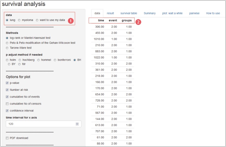
The Kaplan-Meier method is used to calculate the Survival Probability Estimate while conducting the Survival Analysis.1 The Kaplan-Meier curve is visualized by this method. Common statistical programs draw this, but it is cumbersome to draw to show all the necessary information neatly and easily. Authors sometimes want to express the 95% confidence interval (CI) of the Survival Probability Estimate, and Journal of Korean Medical Science (JKMS) recommends censored data and number at risk.
METHODS
First, visit the site.234 The example data ‘lung’ is pre-loaded (1). The example has three field names (2): ‘time’, ‘event’, and ‘groups’ (Fig. 1).
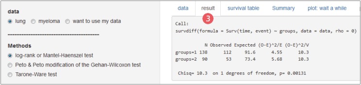
In the ‘result’ tab you will see the statistical results (3). The most commonly used ‘log-rank or Mantel-Haenszel test’ appears by default. A menu is provided in ‘Methods’ to select ‘Peto & Peto modification of the Gehan-Wilcoxon test’ and ‘Tarone-Ware test’ (Fig. 2).
Fig. 2
The ‘result’ tab showing the results of the log-rank test and the menu for selecting different statistical methods.
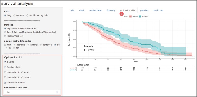
The ‘plot’ tab draws a Kaplan-Meier curve and (4) options in ‘Options for plot’ are on the left. It is almost always necessary to properly adjust the ‘time interval for x axis’ to fit your time unit. The remainder will not require editing in most cases (Fig. 3).
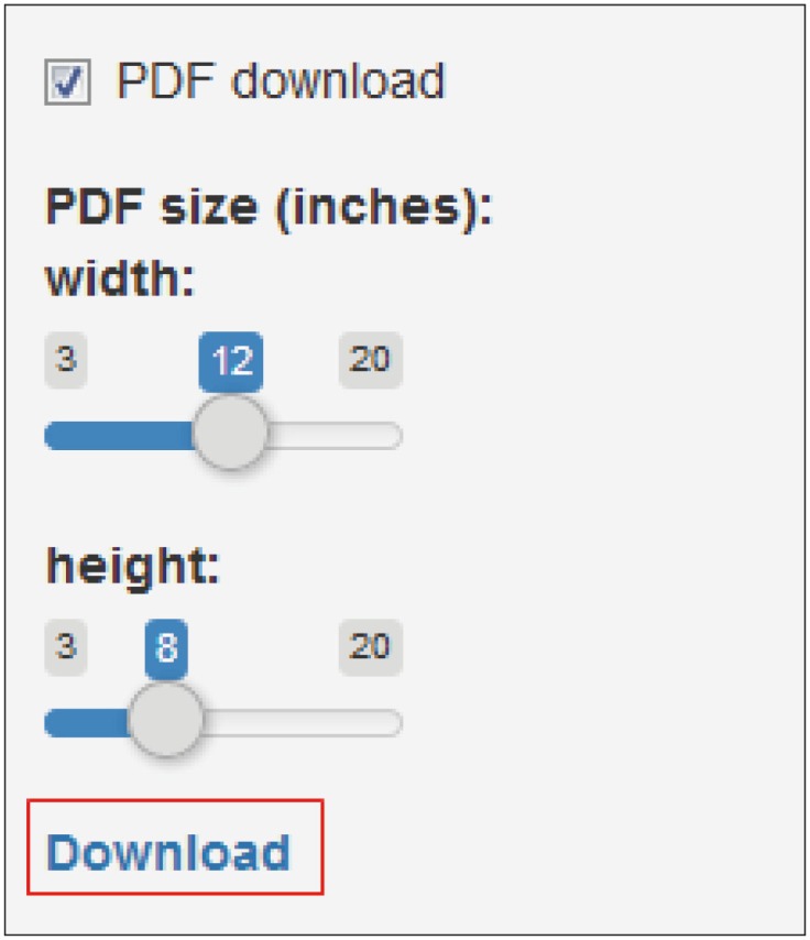
After enabling ‘PDF download’ and clicking ‘Download’, the edited plot will be downloaded. JKMS recommends that you send the PDF file directly without converting the plot to other formats such as jpg or png. If you want to increase the size of the text, you can reduce the size of the PDF (Fig. 4).
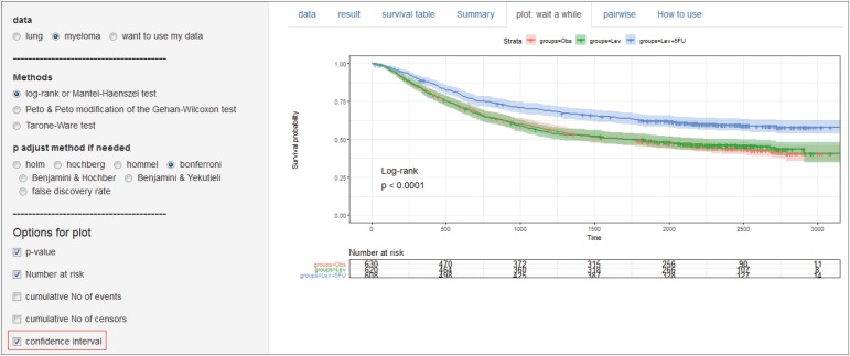
‘Myeloma’ the second example, compares 3 groups, so you can see three Kaplan-Meier curves in the figure. The lower two are almost superposed and there is little difference, and one is located at the top. If several Kaplan-Meier curves overlap and are not well-defined, you can disable the ‘CI’ (Fig. 5).
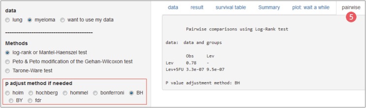
Comparing multiple groups requires post-hoc pairwise comparisons. You can see it by opening the Pairwise tab (5) and you can specify ‘P adjust method’ (Fig. 6).
The survival table and the Summary tab also have important information, but this article focuses on plot, so I will not go into details.
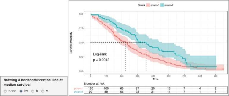
Some options are available depending on the needs of other authors. The median survival time can be displayed on the plot via the ‘horizontal/vertical line at median survival’ option (Fig. 7).
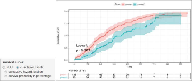
You can draw various plots through the options of ‘cumulative events,’ ‘cumulative hazard function’ and ‘survival probability in percentage’ (Fig. 8).
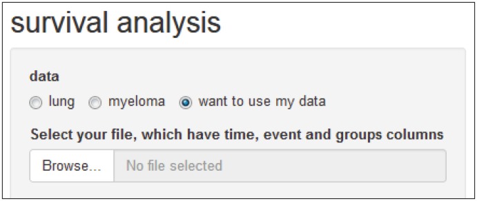
When you upload your data, you must put the three field names ‘time,’ ‘event’ and ‘groups’ in Excel and save it as csv file. Select ‘want to use my data’ and click ‘Browse’ to upload (Fig. 9).
You do not need to worry about fonts or font sizes. Most level journals, including JKMS, redraw the plots. This is because journals have unique colors and fonts. Therefore, if you send a PDF file after specifying the size of the image, they will be able to publish it with appropriate processing (Fig. 10).
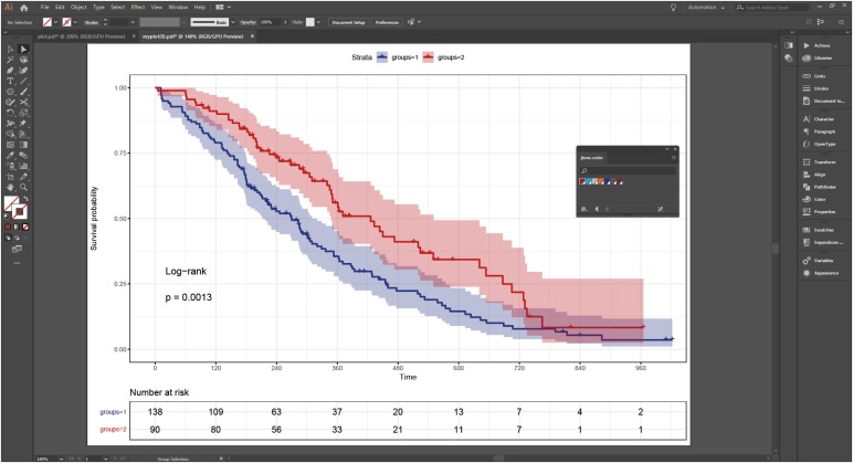
This plot is created by using one of the R packages, survminer.5
 XML Download