

 PDF
PDF Citation
 Print
Print


INTRODUCTION
The results of many studies can be expressed as numeric data. If you properly express these numeric data, you will be able to understand your data well, which is good for setting hypotheses or drawing conclusions and for presenting your results to readers as well.
However, many existing studies have expressed this as a table or sentence, which may be because the authors did not know the proper method. We hope that by introducing some examples and methods, your research will be easier and your presentation will be more effective.
FIVE TOOLS FOR NUMERIC DATA
The five tools for numeric data are presented at “https://tinyurl.com/Plot4Numeric” or “https://statistics4everyone.blogspot.com/2023/02/plots-for-numeric-data.html”.
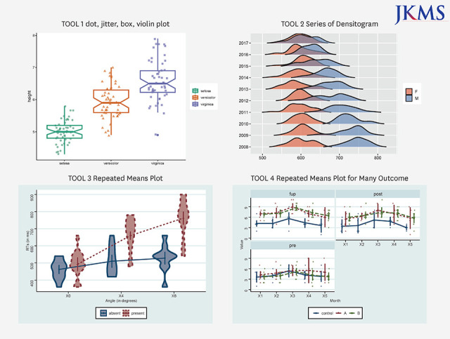
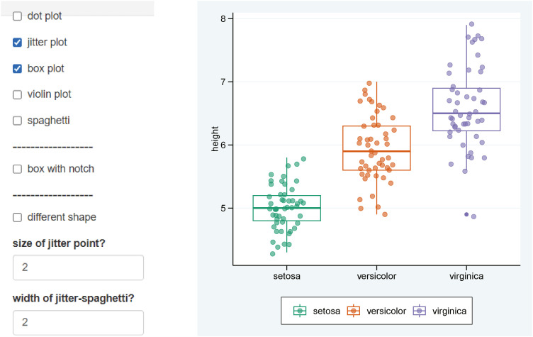
The first one is a tool that allows you to draw dot, jitter, box, violin plot. Please click on the first picture to see the first tool (Fig. 1).
The example data contains numeric columns and strings. We selected columns 1 and 5 (Fig. 2).
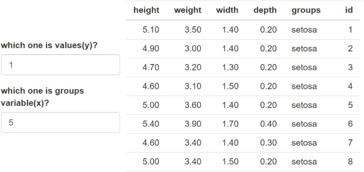
You can see boxplot and jitter plot on the second ‘plot’ tab. This is a representative plot of how the numbers are distributed for each group (Fig. 3).
Boxplot is a representation of the median, maximum, minimum values and interquartile ranges. You can turn off the display of notch representing the confidence interval of the median. The jitter plot was randomly scattered to prevent overlapping points indicating the position of the value. You can adjust the shape, size and degree of scattering of dots (Fig. 4).
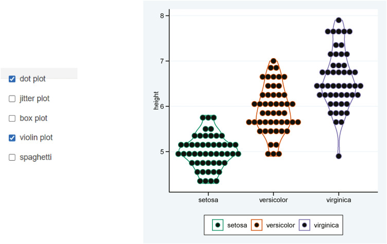
In addition, dot plot and violin plot are also commonly used. You can select dot plot, violin plot, box plot and jitter plot properly (Fig. 5).
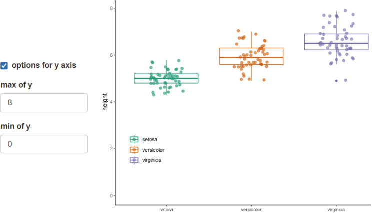
You can use ‘options for y axis’ to adjust the range of the y axis (Fig. 6).
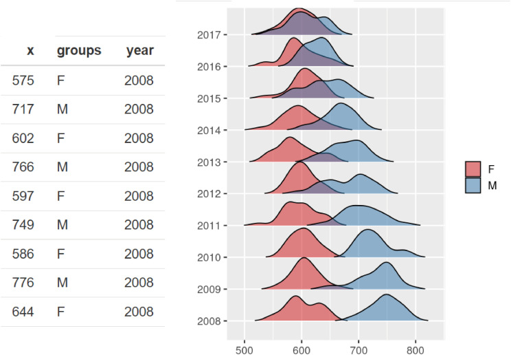
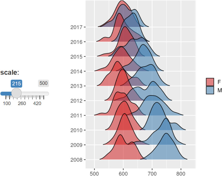
Click the second picture to start ‘TOOL 2 Series of Densitogram’ (Fig. 1).
The Densitogram is an excellent tool for showing the distribution of continuous variables.
Just think about the bottom two Densitograms. You can see that there is a gap between the red and blue Densitogram without overlapping. This is hypothetical data showing the difference between men and women’s wages.
On the y axis, there are number of years from the past to the present. This shows how the distribution of these two groups are changed over time. Or let’s say there are different countries or regions on the y axis. It is an excellent graph to show the wage gap between men and women in different countries or at different points in time.
The form of the data for the Series of Densitogram should have variable names of x, groups and year. In this data, year was used but other things can be used, such as country or region names. It will be arranged in a graph in alphabetical order (Fig. 7).
Sometimes, if there are too many values on the y axis, regulate scale more than 100 to overlap the two Densitograms (Fig. 8).
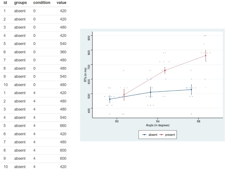
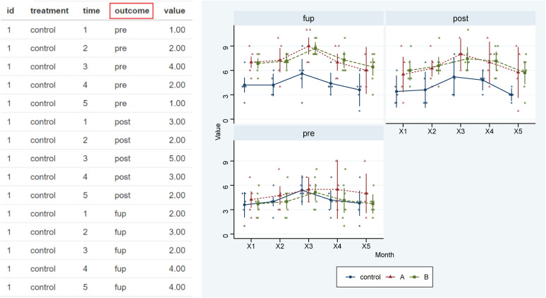
You can also connect the ‘TOOL 3 Repeated Means Plot’ by clicking on the third picture. It shows similar to the Series of Densitogram, which can be better used in experimental research in medical research (Fig. 1).
The important difference from the Series of Densitogram is that the same subject is measured repeatedly several times. The same subject has the same id, the color varies depending on the groups, and condition mainly refers to the day, week or month of measurement. In some times, condition may indicate the strength or capacity of the treatment. Results are expressed by dots, lines and error bars which are commonly used in medical journals (Fig. 9).
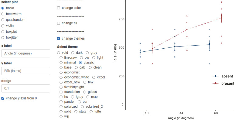
You can select plots that suit for you from various kinds. Boxjitter is a mixture of box plot and jitter plot (Fig. 10).
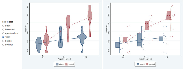
There are lots of options available. Dodge can make the error bars separate so that they don’t overlap. You can force the range of the y axis to start from 0. You can control colors and themes (Fig. 11).
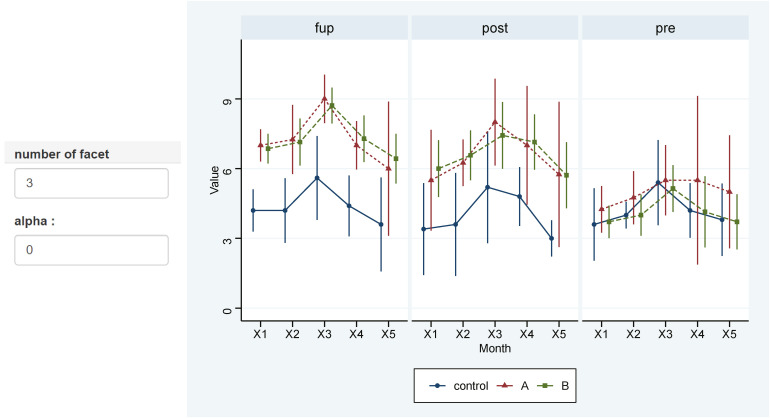
‘TOOL 4 Repeated Means Plot for Many Outcome’ is an expansion of TOOL 3, which can handle many outcomes. In clinical research, there are many cases of measuring several outcomes is one study, and this is a tool made to express them at all (Fig. 1).
The ‘Repeated Means Plot for Many Outcome’ is an outcome added version of data structure of ‘Repeated Means plot.’ So you can draw multiple graphs at once (Fig. 12).
You can draw multiple graphs, so you can set the number of facets to adjust the number of graphs to be placed horizontally, and if lots of dots look messy, you can set alpha to 0 (Fig. 13).
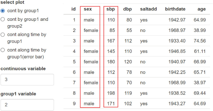
TOOL 5 Aggregate plot is not only a good tool for drawing graphs, but also a good tool for summarizing data (Fig. 1).
Select ‘cont by graph1’ from ‘select plot.’ Variable sex and systolic blood pressure (SBP) were selected from data. It means you chose one group variable and one continuous variable (Fig. 14).
Fig. 14
The structure of the data and the types of possible plots.
SBP = systolic blood pressure, DBP = diastolic blood pressure.
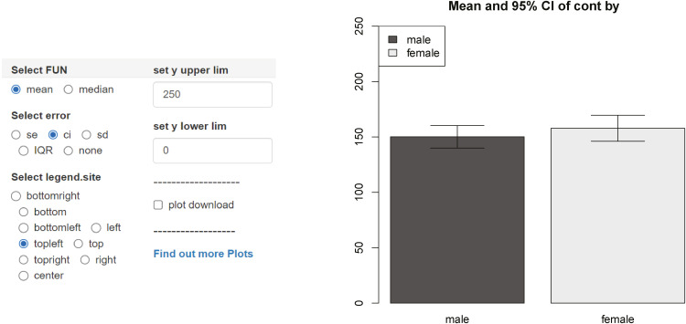
The first plot shows the mean value and confidence interval (CI) of SBP by gender. In addition to CI, the error bar can represent standard errors, standard deviation, interquartile range (IQR) and so on. If you select the median instead of the mean, the interquartile range is selected as the margin of error automatically. There are other intuitive options also (Fig. 15).
Fig. 15
The results and options of the first plot.
CI = confidence interval, SE = standard error, SD = standard deviation, IQR = interquartile range.
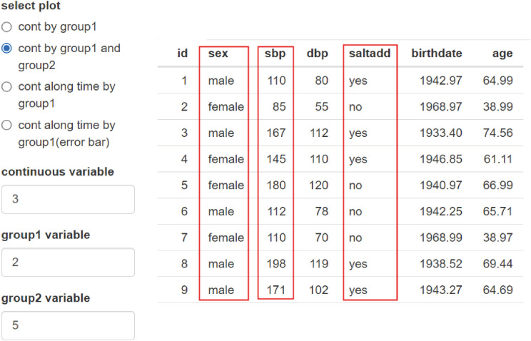
Now, you can select two nominal variables by selecting ‘cont by group1 and group2.’ In other words, I chose one more variable, that indicates who consumes lots of salt and who doesn’t (Fig. 16).
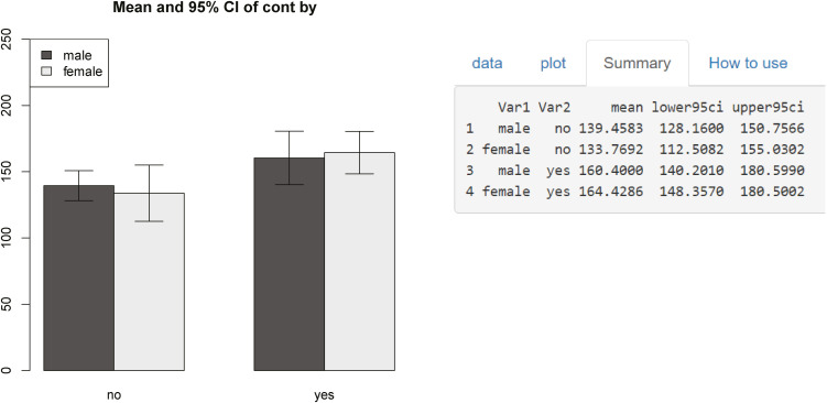
The second plot shows the results divided by these two group variables. It shows that groups who consume lots of salt have higher blood pressure. There is a little difference between gender. If you open the third tab, the values shown in the graph appear as numbers, and you can easily get them whenever you change the conditions, such as the average of each group and the standard deviation (Fig. 17).
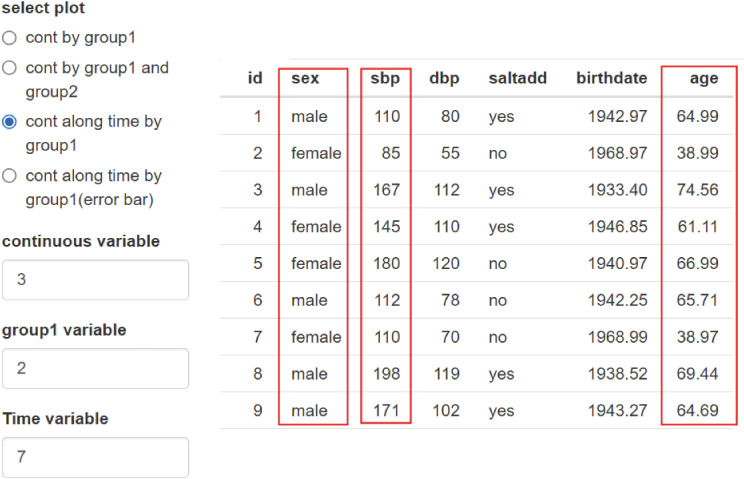
The third plot adds age as a time variable to blood pressure according to gender (Fig. 18).
Fig. 18
Third plot and data structure.
SBP = systolic blood pressure, DBP = diastolic blood pressure.
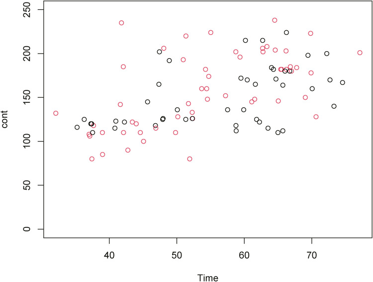
You can draw the blood pressure graph of men and women, but it looks messy and it is hard to figure out the tendency (Fig. 19).
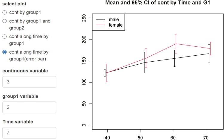
Now let’s choose the fourth plot. The variables are the same. However, it has become much easier to identify trends. Because the data are summarized as mean and error bar. You can see that women have a slightly higher average than men, and the difference is wider around the age 60. There may be some differences in interpretation, but what the data shows is much clearer than before. Note that the horizontal axis gaps of error bars are slightly different (Fig. 20).
Fig. 20
A plot of male and female blood pressure according to age, using mean and error bars.
CI = confidence interval.
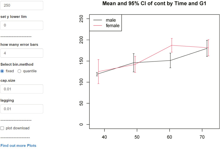
Now let’s change the bi.method from quantile to fixed. The horizontal gaps of the error bar became same. Fixed keeps age intervals equal like as 10s, 20s and 30s. On the other hand, quantile tries to set the same numbers in each interval. So, 100 people are divided into 4 sections, 25 people. Therefore, the horizontal gap may be uneven depending on the data.
If there are enough data, you can use fixed to get enough numbers in one section, but if there are not, you need to use quantile and fewer sections to trust the data. Optionally, the numbers of intervals can be specified as ‘how many error bars’ (Fig. 21).
On the third tab, you can get a summarized numerical value also.
 XML Download