

 PDF
PDF Citation
 Print
Print


INTRODUCTION
The results of many studies can be expressed as categorical data. If you properly express these categorical data, you will be able to understand your data well, which is good for setting hypotheses or drawing conclusions and for presenting your results to readers as well.
However, most of the existing studies have expressed this as a table or sentence, which may be because they did not know the proper method. We hope that by introducing some examples and methods, your research will be easier and your presentation will be more effective.
FIVE TOOLS FOR CATEGORICAL DATA
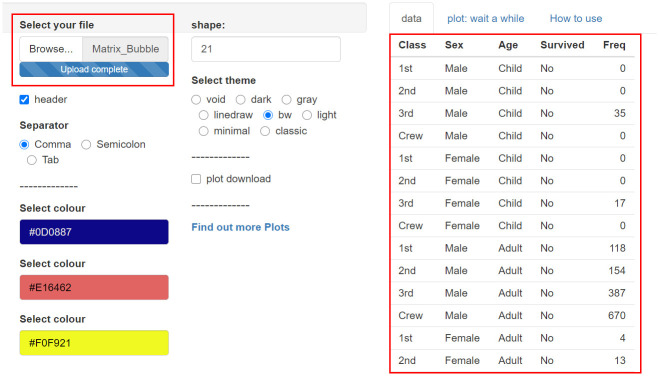
The first tool for categorical data is “https://tinyurl.com/Matrix-Bubble-Plot” (Fig. 1).
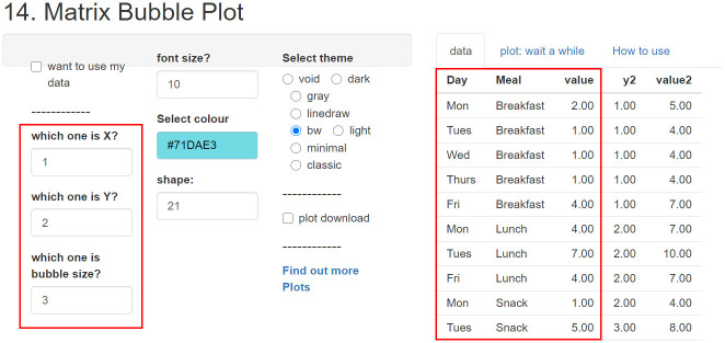
There are sample data, and it graphs the 3 columns selected by the researcher. That is, the 1st variable to be arranged on the horizontal axis, the 2nd variable to be arranged on the vertical axis, and the 3rd variable to determine the size of the ‘bubble.’
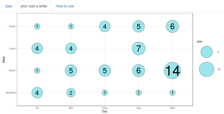
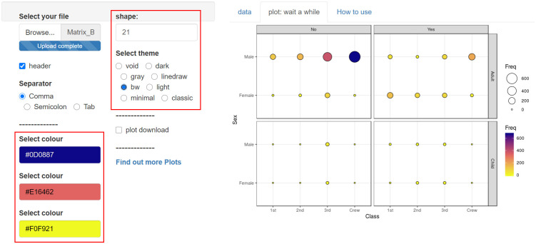
The result is displayed in the second tab, ‘plot: wait a while’ (Fig. 2). It shows you a picture of bubbles sizing counts, so you can easily understand the overall results. At this time, the axis values are automatically rearranged in alphabetical order. In the case of the days of the week, the order is changed. So, we recommend renaming the values, such as 1Mon, 2Wed, etc... to change the order of the days intentionally.
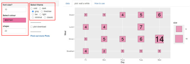
You can change ‘font size’ ‘color selection’ ‘shape’ and ‘theme selection’ (Fig. 3).
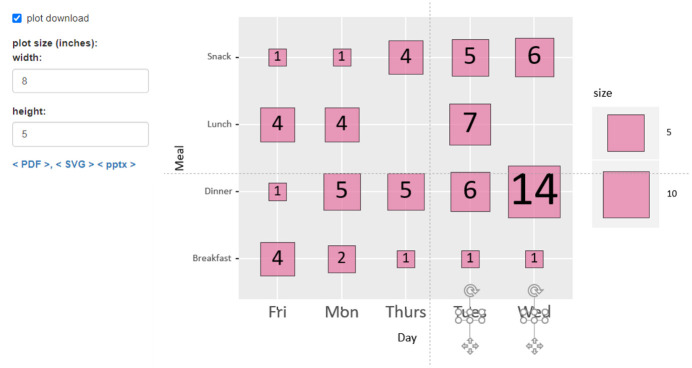
Activate ‘plot download’ to determine ‘width’ and ‘height,’ and then download the plot in three formats: <PDF>, <SVG>, and <pptx> (Fig. 4). All three types are vector files that can be further edited using appropriate tools. For instance, in PowerPoint, it can be converted into an editable form using ctrl+shift+G. As you see, the sequence of X axis is changed in alphabetical order. If you are uploading data as ‘1Mon, 2Tues, 3Wed, 4Thurs, 5Fri’ and removing the numbers in PowerPoint, you can specify the sequence.
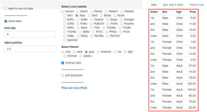
For more complex cases, “tinyurl.com/Matrix-Bubble-Plot-facet” is a suitable one (Fig. 5). Since there is no example data, export your data from Excel to the CSV file and then upload this file. At this time, the data must be arranged in 4 columns of categories and the 5th column of frequencies as shown in the figure.
The four categories are arranged in order, horizontal, vertical, horizontal, and vertical to show the results (Fig. 6). If your data is in 3 categories, you can put all the same values in one category. Frequency is expressed by the size and color of the circle. You can select the ‘color,’ ‘shape,’ and ‘theme’ you want, download, and use it.
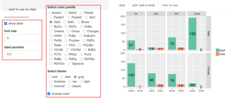
The third tool is “tinyurl.com/Matrix-Bar-Chart.” This tool is good for representing categories in 3 columns and frequency in the 4th column (Fig. 7).
The rules for how each category are laid out can be seen by comparing the sample data and plots. Some options, including the size and position of the font, are intuitive (Fig. 8).
All the tools introduced so far have a form of frequency data (Fig. 9).
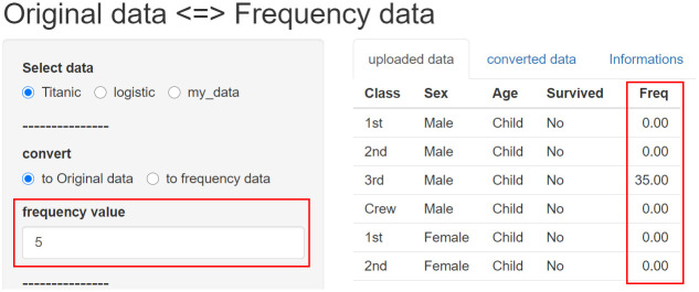
“tinyurl.com/Origin-freq” can changes into ‘Original data’ or ‘Original data’ into ‘Frequency data’. There is an example of ‘Frequency data,’ select the 5th column of the example to show the frequency.
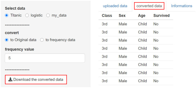
When you open the ‘converted data’ tab, the changed data is displayed, and the changed data can be downloaded as a CSV file (Fig. 10).
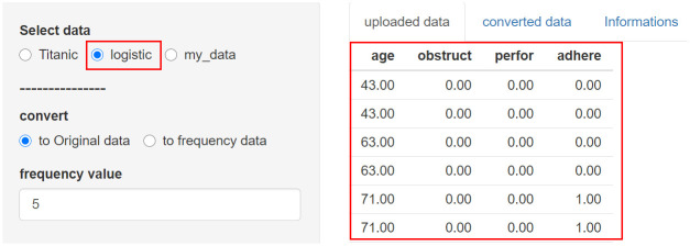
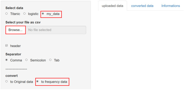
If you select ‘logistic,’ an example of original data is displayed, that is, one row represents one person (Fig. 11).
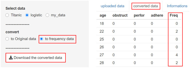
Select ‘to frequency data’ and open the ‘converted data’ tab to summarize and organize the data with a Freq column. Download it and you will get a CSV file (Fig. 12).
After uploading your data, you can convert it in an appropriate direction, and the downloaded data can be easily expressed as a graph using the previously introduced tools (Fig. 13).
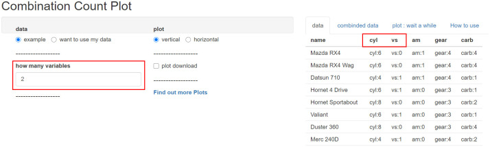
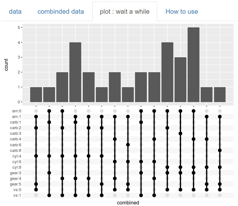
‘Combination Count Plot’ has been shown a lot in relatively recent papers, which can be made at “tinyurl.com/Combi-Plot” easily (Fig. 14). Column 1 in the data will be the name or ID. If you select two variables, it means that you will analyze only ‘cyl’ and ‘vs.’
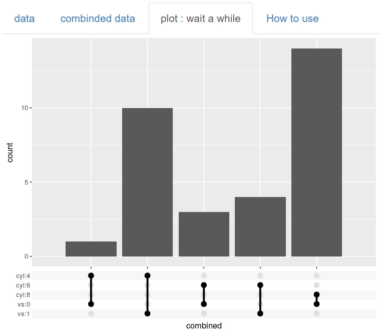
There are 3 levels of ‘cyl’ variables and 2 levels of ‘vs’ variables, so there can be a total of 6 levels. There is also a missing level, however, so we can see 5 bars showing the count (Fig. 15).
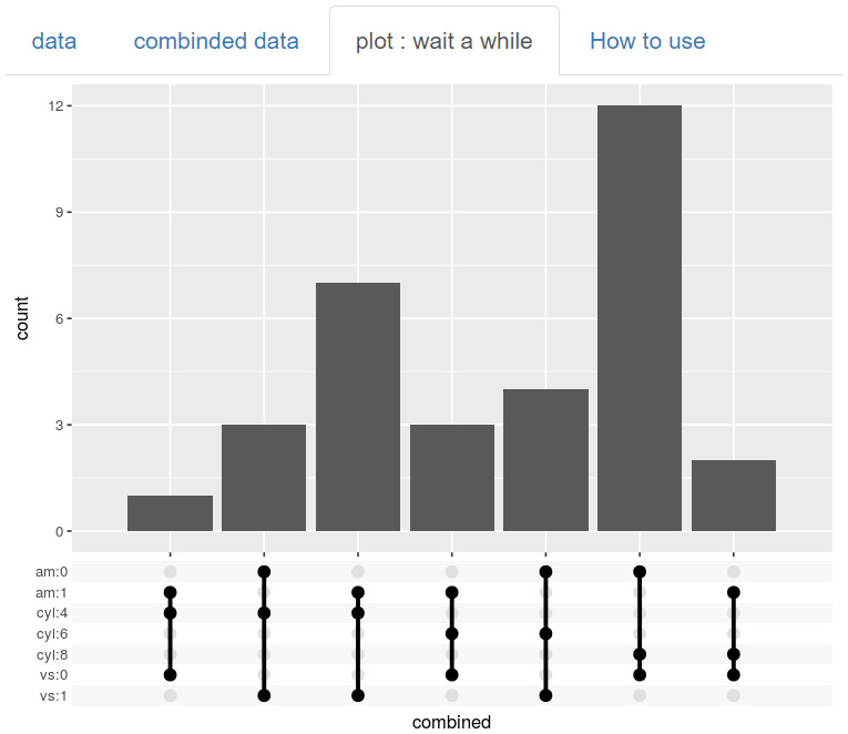
If you select 3 variables, more combinations are possible. The more variables you choose, the more combinations and bars you will have (Fig. 16).
You can select five variables or select more variables to analyze. The three tools discussed before can only analyze up to four variables, but this tool can easily analyze more variables. Of course, it's complicated, so you need to use it carefully (Fig. 17).
Fig. 17
The combination count plot can analyze more than 4 variables compared to the other tools discussed above.
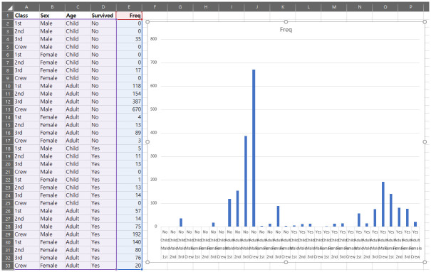
Since this ‘Combination Count Plot’ is very useful, it has been used a lot recently, but when it is organized into frequency data, it is graphed in Excel, similarly but more complexly (Fig. 18).
SUMMARY
We have introduced five tools. After properly converting your own data from “tinyurl.com/Origin-freq,” it might allow you to create and obtain graphs for your own purpose by using “tinyurl.com/Matrix-Bubble-Plot,” “tinyurl.com/Matrix-Bubble-Plot-facet,” “tinyurl.com/Matrix,” and “tinyurl.com/Matrix-Bar-Chart.” To express more variables, “tinyurl.com/Combi-Plot” may be more appropriate. Categorical data is very common in medicine, and it is very useful to researchers and readers to understand and present it appropriately.
 XML Download