

 PDF
PDF Citation
 Print
Print


INTRODUCTION
A receiver operating characteristic (ROC) curve shows clinical sensitivity and specificity for a test or a combination of tests. Various statistical analysis softwares can be used to draw a ROC curve. But most of them fall short of what is required by authors, such as displaying 95% confidence interval (CI) or comparing diverse ROC curves in hypothesis testing. We introduce fancy ways to draw a ROC curve in a functional way as the second guideline of drawing for manuscripts of the Journal of Korean Medical Science (JKMS). The first guideline introduced how to draw Kaplan-Meier curves.1
INSTRUCTION
The first tool for ROC
Fig. 1
First tool for ROC. (A) Initial screen and example data. (B) One ROC plot. (C) Three ROC curves. (D) One ROC curve with CIs.
ROC = receiver operating characteristic, AUC = area under curve, CI = confidence interval.
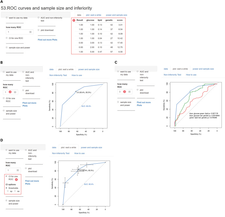
Data for drawing a ROC curve can be input on ‘data’ tab. In example data ❶, the 1st column shows the result of a diagnosis (no disease, 0; disease, 1) and the other columns show the values of variables (glucose, lipid, genetic, and score). You can find that as the values increase, the higher the probability of the presence of a disease. You can draw multiple ROC curves for each variable adding the number columns up to 4 in this tool.
The number of ‘How many ROC’ is set ‘1’ ❷ and the ROC curve was drawn following the 2nd column data (Fig. 1B). Area under curve (AUC), which is a widely used measure for diagnostic accuracy of quantitative tests, is automatically calculated and shown below the diagonal line (45° line). It is well known that a test with no better accuracy than random chance has an AUC of 0.5. An AUC value less than 0.5 indicates that coding might have been done inversely.
The point displayed over a ROC curve indicates one of the adequate cutoff values. There are several ways to determine a cutoff value, where a displayed value should not be considered as a categoric value. It is just a suggested value for satisfying users' desire to get a cutoff value.
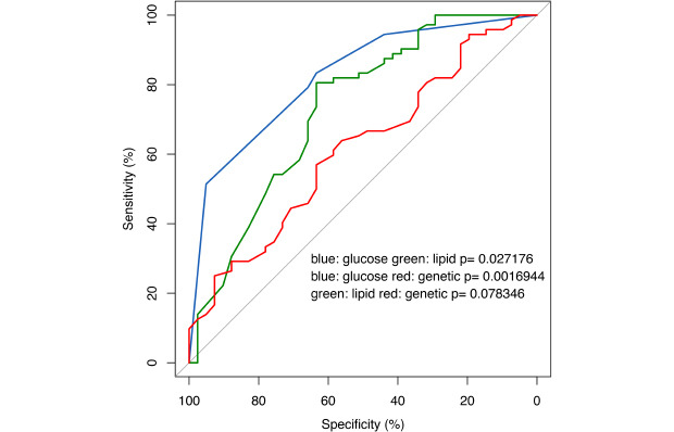
As the number of ‘How many ROC’ increases ❸, ROC curves following the data of the other columns are drawn in different colors. You can test a statistical hypothesis by comparing to the first ROC curve (Fig. 1C). The test was done based on the method of Delong.2
Within one ROC curve, CI is represented by checking ‘CI for one ROC’ ❹ (Fig. 1D). You can get CI for the specificity (sp) or sensitivity (se) individually by checking CI options.
It also provides the sample size, or non-inferiority test; however, this article shows how to draw a ROC curve, which would not be covered in detail.
The second tool for ROC
Second tool https://tinyurl.com/classifier-plot deals with one ROC in detail (Fig. 2A). Sample data are composed of two columns, and it takes time to get a ROC curve.
Fig. 2
Second tool. (A) Initial screen of classifier plot. (B) Lists of available curves. (C) Density plot.
AUC = area under curve, CI = confidence interval.
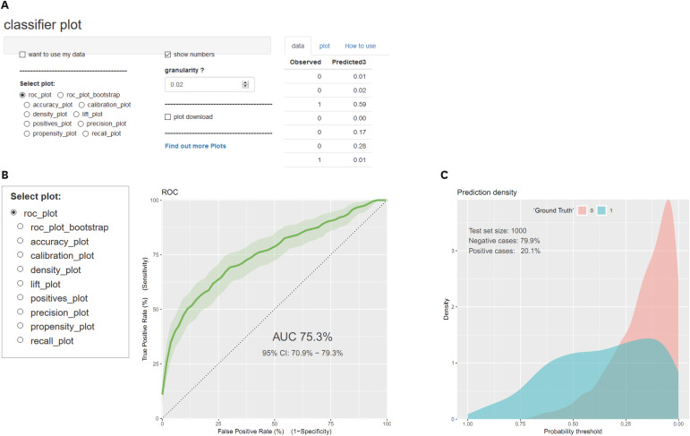
Checking ‘roc_plot’ the following ROC curve is drawn. It also provides AUC and 95% CI at the same time (Fig. 2B). ‘Roc_plot_bootstrap’ takes quite a long time and you can also take a look through other options.
A density plot visualizes the distribution of data over a continuous interval, which lets us better understand how a ROC curve is made (Fig. 2C). Be aware of the direction of the X-axis, the value of which increases in reverse.
The third tool for ROC
Third tool https://tinyurl.com/calibration-plot also treats one ROC curve in detail (Fig. 3A). Sample data are composed of five columns, but just one column of predicted value is selected ❺ and analyzed. Five types of plots are given, and the following steps would cover some of them.
Fig. 3
Third tool. (A) Initial screen of calibration plot. (B) Available thresholds options. (C) Select multiple threshold methods. (D) Various optimal thresholds result. (E) Various optimal thresholds represented on plot.
ROC = receiver operating characteristic, AUC = area under curve.
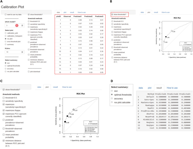
Meaningful points are represented over a ROC curve, checking ‘show thresholds?’ Multiple points can be represented checking threshold methods on ‘plot’ tab (Fig. 3B).
For example, four threshold methods are checked and represented over a ROC plot (Fig. 3C).
‘Result’ tab shows various optimal thresholds numerically (Fig. 3D).
‘Error.threshold.plot’ rarely suggested in treatise can be helpful for decision making (Fig. 3E).
The fourth tool for ROC
This, https://tinyurl.com/ROC4table-model, is a tool for converting data organized as table or multivariable logistic regression to ROC curve directly (Fig. 4A). It is useful for data to be organized as the shown sample rather than individual data.
Fig. 4
Fourth tool. (A) ROC from table or model. (B) Calculated specificity and sensitivity using data. (C) Select color of line and grid. (D) Data for logistic regression. (E) Result of logistic regression. (F) Diagnostic table as a result of logistic regression. (G) ROC curve from logistic regression.
ROC = receiver operating characteristic.
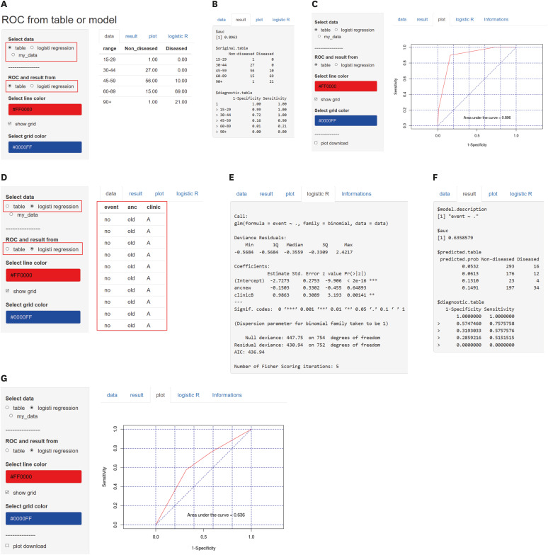
In ‘result’ tab, specificity and sensitivity are calculated following each threshold (Fig. 4B).
It is an intermediate course getting a ROC curve, so it is helpful to understand the method.
Color of line and grid can be modulated (Fig. 4C).
There are various prediction models, and it provides logistic regression which is the most commonly used (Fig. 4D). First column of data needs to be nominated as ‘event’ and the data should be coded as no or yes (0 or 1).
‘Logistic R’ tab shows the result of logistic regression (Fig. 4E).
‘Result’ tab is composed of predicted table and diagnostic table, both of which are an intermediate course for plotting a ROC curve (Fig. 4F).
‘Plot’ tab shows the ROC curve (Fig. 4G).
How to upload data and download plots
The plotted ROC curve can be downloaded in the following steps. After identifying the ROC curve, check ‘plot download’ and determine the size (Fig. 5A). We recommend plot size 6 inches in width and height each. <PDF> file sent to JKMS can be edited easily. <SVG> or <pptx> files are useful for editing the plot yourself. You can ungroup an image by entering (Ctrl + Shift + G) twice and edit a downloaded plot by using powerpoint.
Fig. 5
How to upload data and download plots. (A) How to download the plot. (B) How to upload your own data.
ROC = receiver operating characteristic.
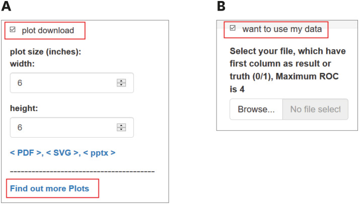
‘Find out more Plots’ provides more several types of plots.
You can use your own data by uploading your file with filename extension <csv> (Fig. 5B).
 XML Download